Thursday, December 8, 2011

Invitations

From time to time I am asked to design an invitation for a friend, and I'm always flattered to do so. In creating invites for them, I found that I knew them so well, the aesthetic came rather quickly and easily, which is nice. And none of them were bridezillas about the thing either.

Jenny is my oldest friend, and for her invitation she wanted to sample art from her late Aunt Kaye, a wonderfully talented artist. Jenny gave me a photo of a cut-paper collage that Kay had done of a sort of jungle/animal scene. I pulled sections out of that piece, re-drew them and used them for her save the date and invitation. She letter-pressed the invites (hence the one-color):
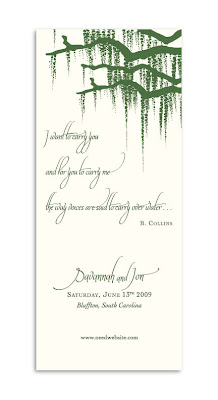
Savannah and Jon are dear friends who got married just outside of Savannah (AND she's from Savannah!) and they wanted a southern feel to their invite. They were married in Bluffton and the trees there are DRIPPING with Spanish moss, so Savannah sent a photo of that for inspiration to use on all her printed materials.

We did the save the date so it could fit into a No. 10 envelope. I love the shape of it.
 
They letter-pressed their invites, too, both sides:

And then we made table cards, each named after an inter-coastal waterway. (It's difficult to see on these smaller versions, but I "carved" their initials into the trunk of the tree.)
When Julie and Evan married, she wanted something very simple and sophisticated, and she wanted it to feature these dogwood berries. She gave me a stick of them and asked if I'd draw them. We ended up using them on the RSVP and invite cards.
Logically, next came some baby shower invitations! Most recently I did one for Ashley, another dear old friend. She's fairly chic and not so into the cutesy baby stuff, so I kept it fairly modern.

Sunday, December 4, 2011

Z v U, or, the dream job


When the book "Zombies Vs. Unicorns" came up for assignment, every designer's hand shot up. In the end, it landed with me and my talented colleague Sonia Chaghatzbanian. We tag-teamed the design and art direction, which made an already fun project even more so.

The book is a collection of short stories that are either zombie or unicorn based. Edited by Holly Black and Justine Larbalestier, the book had meager sales expectations (for some reason anthologies in general just don't sell well), so Sonia and I had carte blanche to do whatever we wanted. The concept and artist came to us quickly and easily—we wanted a zombie-versus-unicorn version of Hieronymus Bosch's The Garden of Earthly Delight and we wanted the hugely talented Josh Cochran to do it. He was on board immediately and then the fun began.

First draft:
Notes back to JC:
Final linework:

The final battle:
In the meantime, Sonia and I were working on the package itself. We miraculously got away with having no names on the front cover, and we created the illusion of a diecut using a deboss, drop shadow and spot matte lam on the cover icons that Josh created for each creature.
We also got Josh to do some of his awesome hand-lettering for the back cover, too, which featured the names of all the wonderful contributors.


We carried all this into the interior, too, using Josh's line drawing for the endpapers and his hand lettering for the table of contents and chapter openers.

In the end, we were all thrilled with what we'd created, AND even better, the sales for this book far exceeded expectations, due in large part (so we are told) to the packaging.

And finally, the cherry on top of this awesome project was that the three of us won a Silver Medal from the Society of Illustrators for the package, Josh for illustrating and Sonia and I for Art Direction. Here's a pic Josh blogged of us proudly posing with our fancy new medals.


Sophie Peterman Tells the Truth!


One of the first projects I got to work on from start to finish at S&S was Sophie Peterman Tells the Truth written by Sarah Weeks, illustrated by Robert Neubecker, and edited by the hugely talented Andrea Welch. I was thrilled to get to work with Robert, I'd been a fan ever since I first saw his WOW! series.

In Robert's early sketches, he hand-lettered the entire text. My eyes bugged out I was so excited (who doesn't love hand lettering?), however,
it was clear that there was so much hand-lettering that it lost much of its impact...

So I started playing with classic, set type to play off his wild, great scrawl...

At the same time, Robert and I got way into character development. Sophie was reading too old, and so we worked on character studies for her, and her brother, at their various ages throughout the book. Robert would send drawings in, I would draw into them in photoshop and lob them back to him, he'd revise and send back.
For Sophie:
For the little brother: Somewhere in there, Robert was about ready to kill me. BUT, in the end, it all came together beautifully, received 3 starred reviews, AND we are happily working on our third book together. So I suppose it wasn't all bad for him. Or for Sophie.

Cronus Chronicles


I re-packaged a series of 3 middle grade novels by Ann Ursu. I needed to brand the series, and update the look of them for today's marketplace. Here's where they were:

To get started, I hired a great logo designer, Craig Howell, who nearly got it right on his first draft. Here's a bit of our process...
Craig got the notes perfectly and delivered a close-to final for his 2nd draft:
In the midst of this, I got talented illustrator and Art Center chum Frank Stockton started on the cover art. We needed action, adventure, cool and colorful. His first draft was a triptych approach, which we loved, but it soon became clear it wouldn't work with Craig's logo. Here's some of Frank's process.

First sketches...
Revised sketches, incorporating the rough logo...

And then the final where it all came together...